Data visualization & Dashboard design
Noda Copilot: Visualizing Energy Intelligence
I re-designed a complex thermal energy management tool from Google Sheets into a dedicated, AI-powered web application.
Local heating supply companies like Kraftringen use the data to optimize their delivery and minimize energy waste.
- Stakeholder & User Interviews
- Component library creation
- Prototyping
- UI Design
- Design for AI
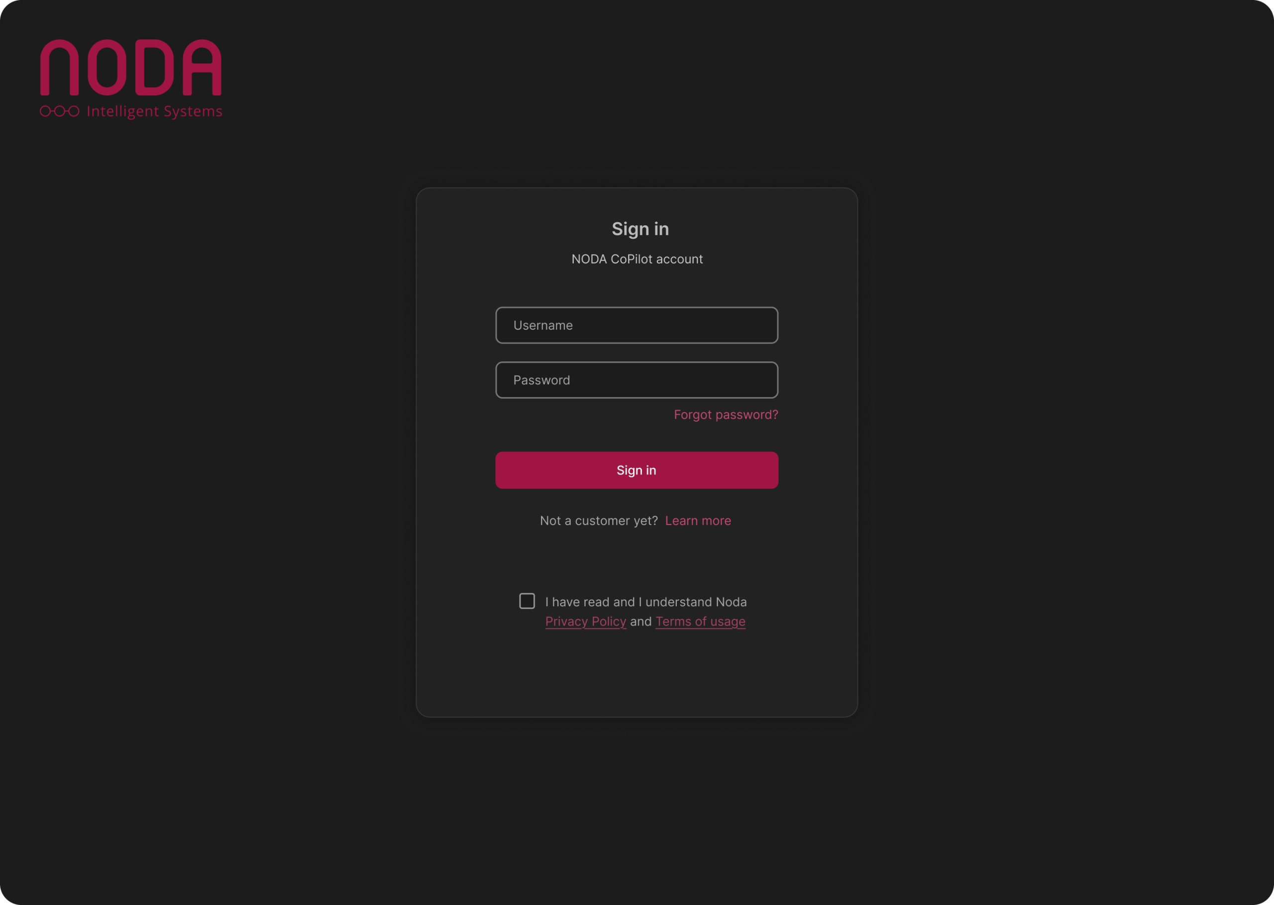
Login experience. My design focuses on a clear visual hierarchy and accessible form fields, complemented by subtle branding to provide a professional and user-friendly entry point to the application.
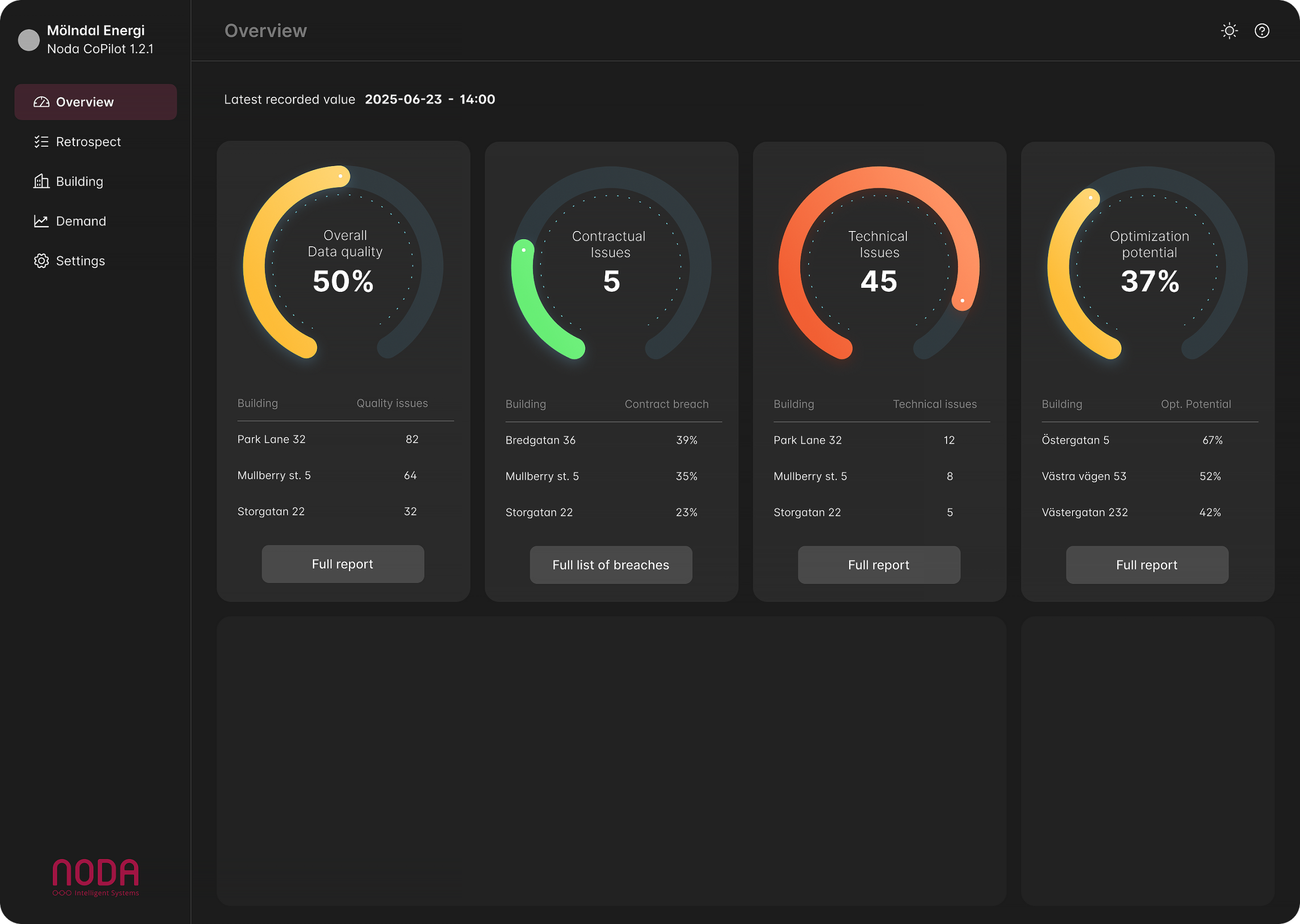
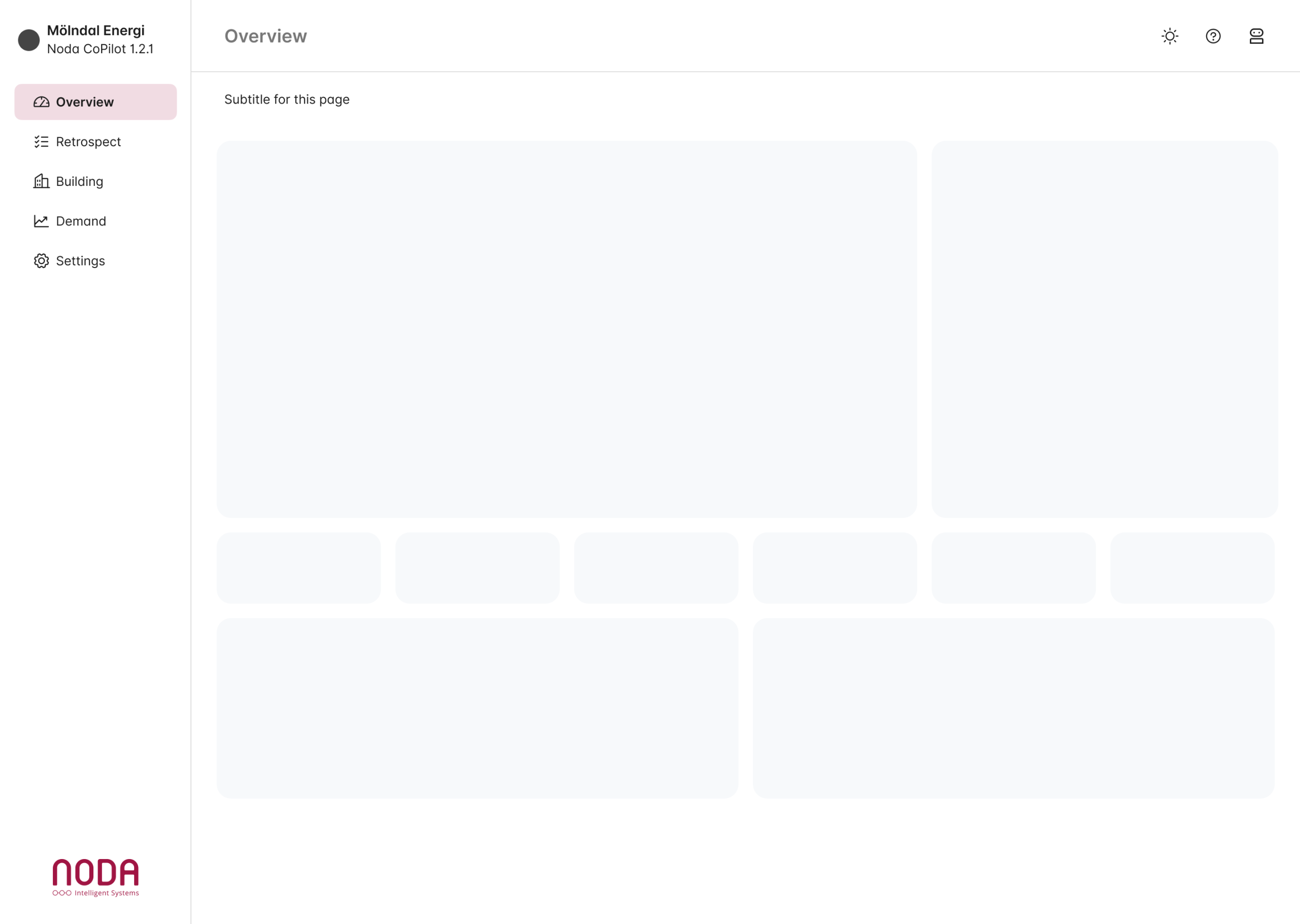
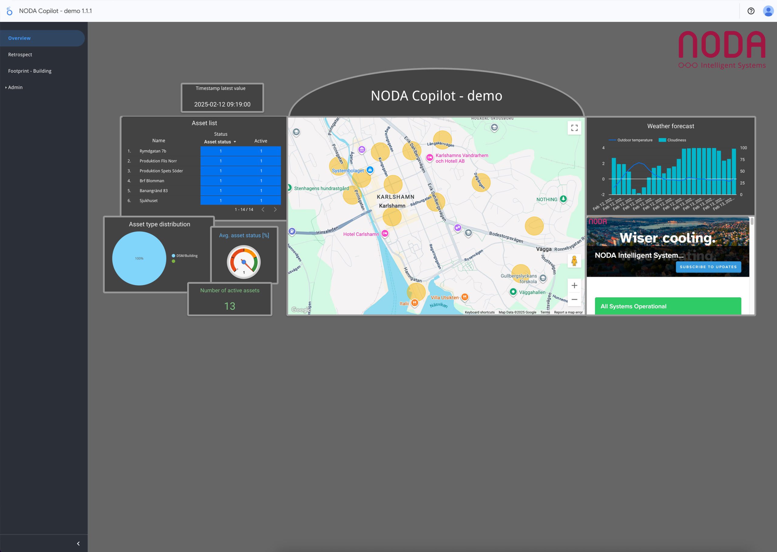
Overview/Landing page. This page focuses on giving the user a quick status check of how their systems are performing. Stoplight colors and visual gauges are used in a way that most users are familiar with.
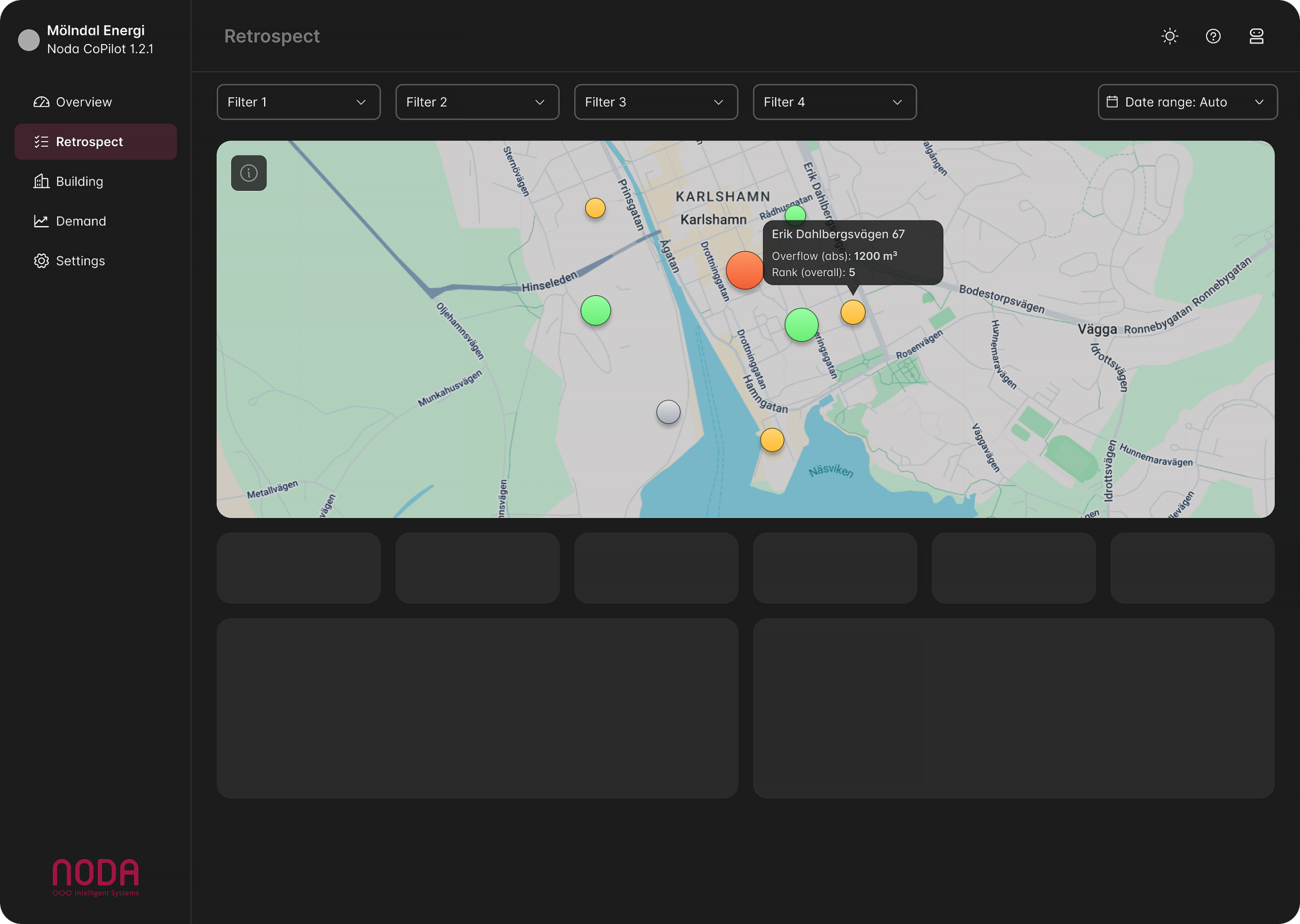
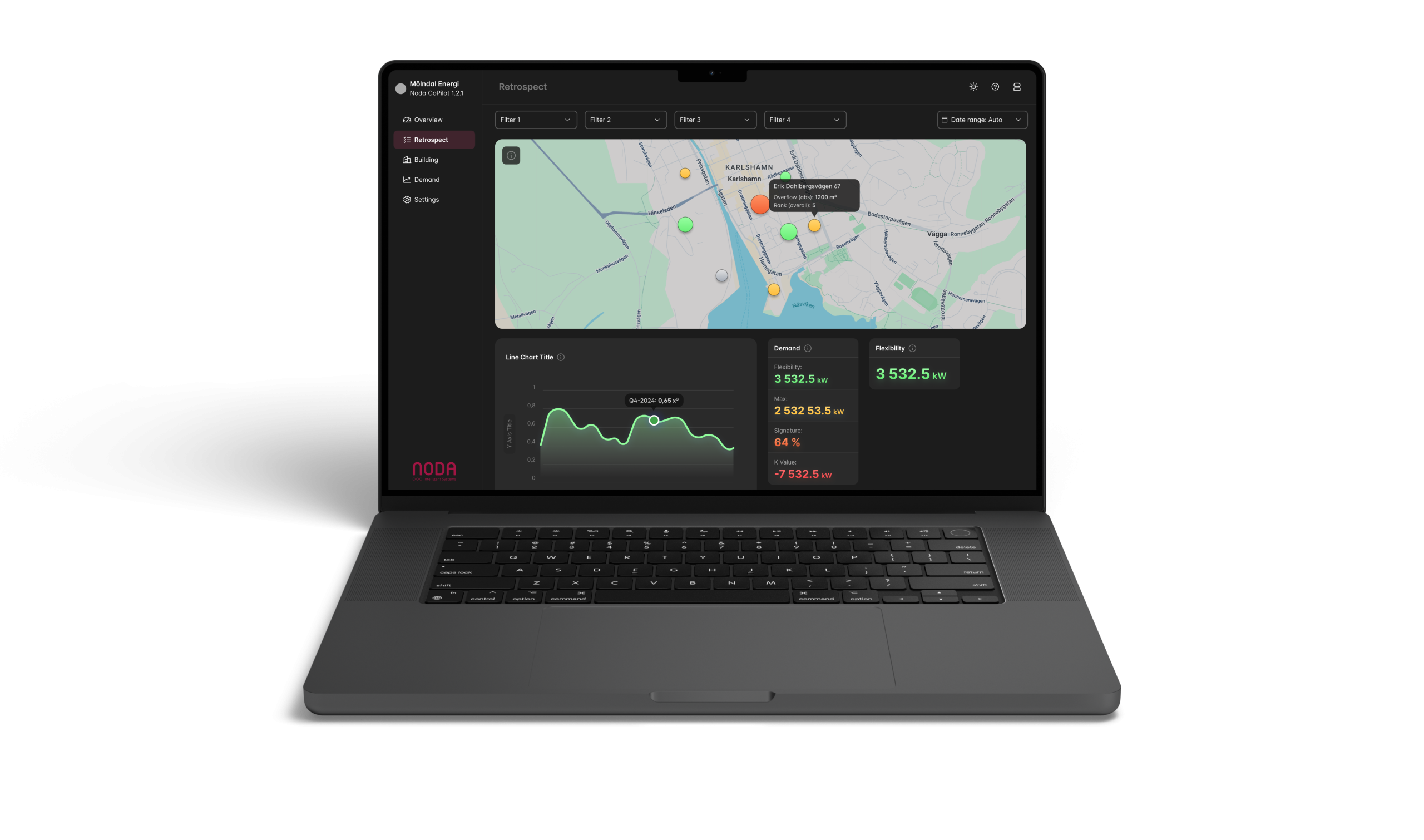
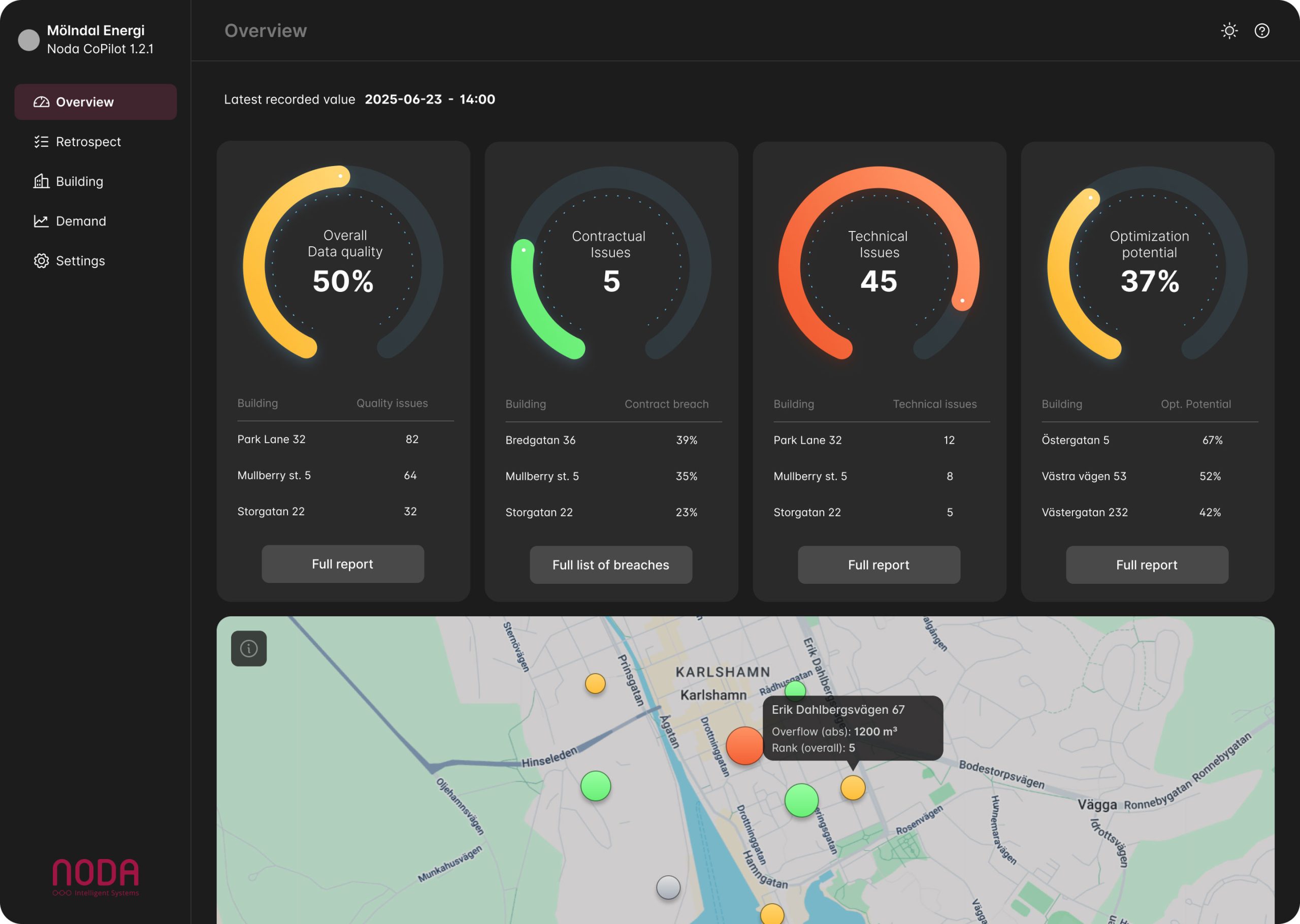
Retrospect page. This is where the user can select one of their buildings or stations on a map and dive into the data. Stoplight colors and size of the map-marker indicate statuses.
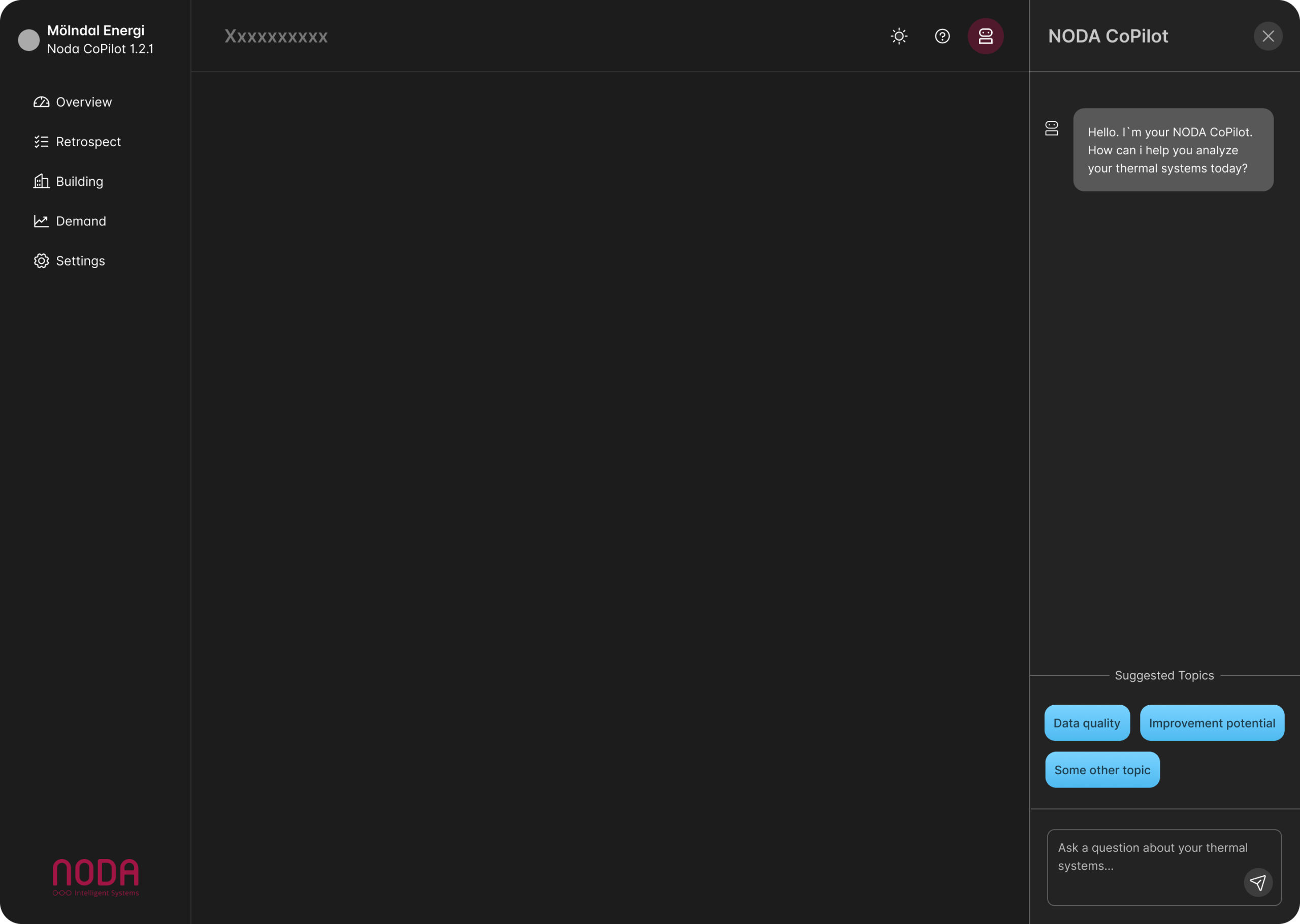
Copilot AI chatbot. The chatbot is available as a slide out column on the right hand side. The chatbot learns about each users specific needs and a list of favorite prompts will be available. The chatbot can also highlight corresponding data in the main screen when it’s answering a prompt.
Light-mode/Dark-mode. Noda wanted the main experience to be dark. But i designed it for both light and dark modes. the user can swith between modes in the header menu.
Components
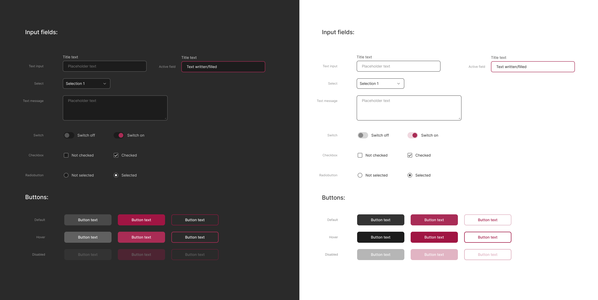
Input components. Made specifically for this project in both light and dark themes.
Charts
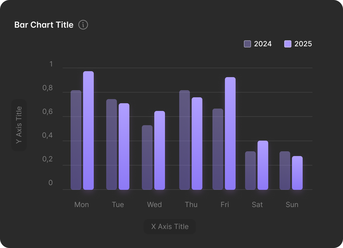
Bar chart. Shows data from two seperate years.
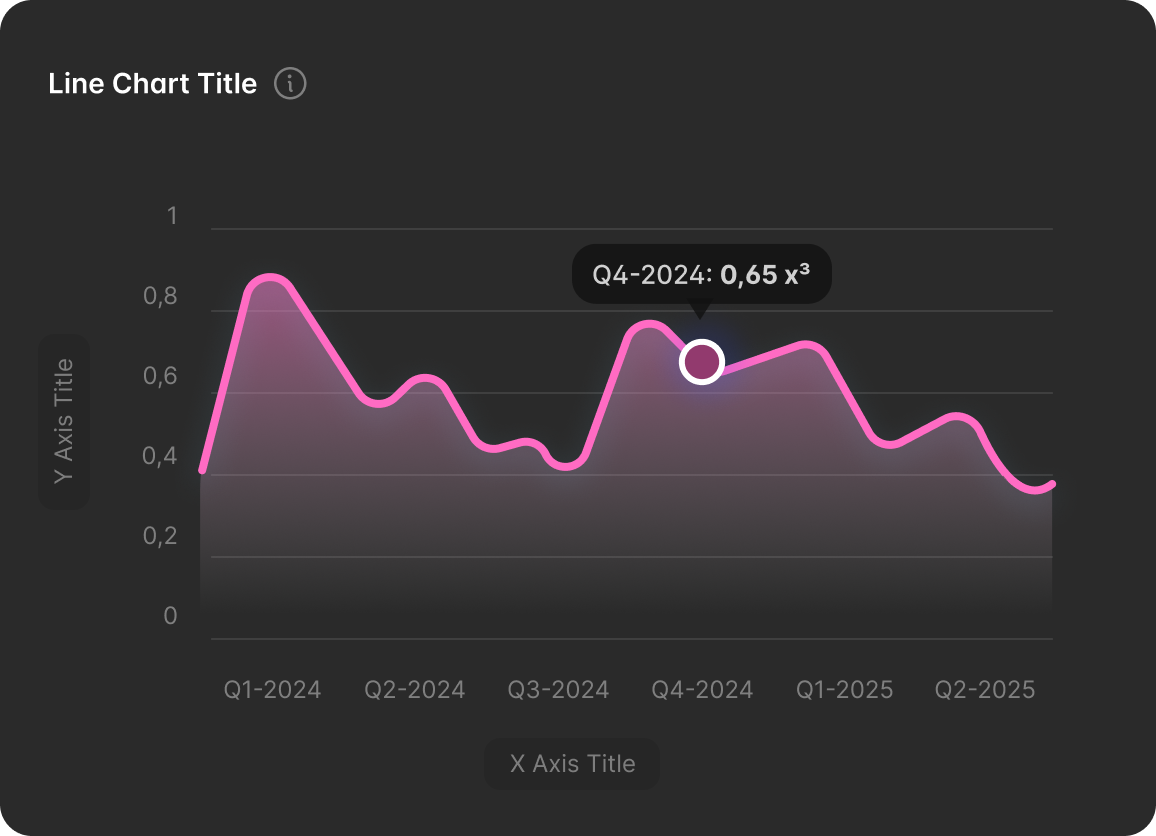
Line chart. Tooltip are shown when hovering the chart.
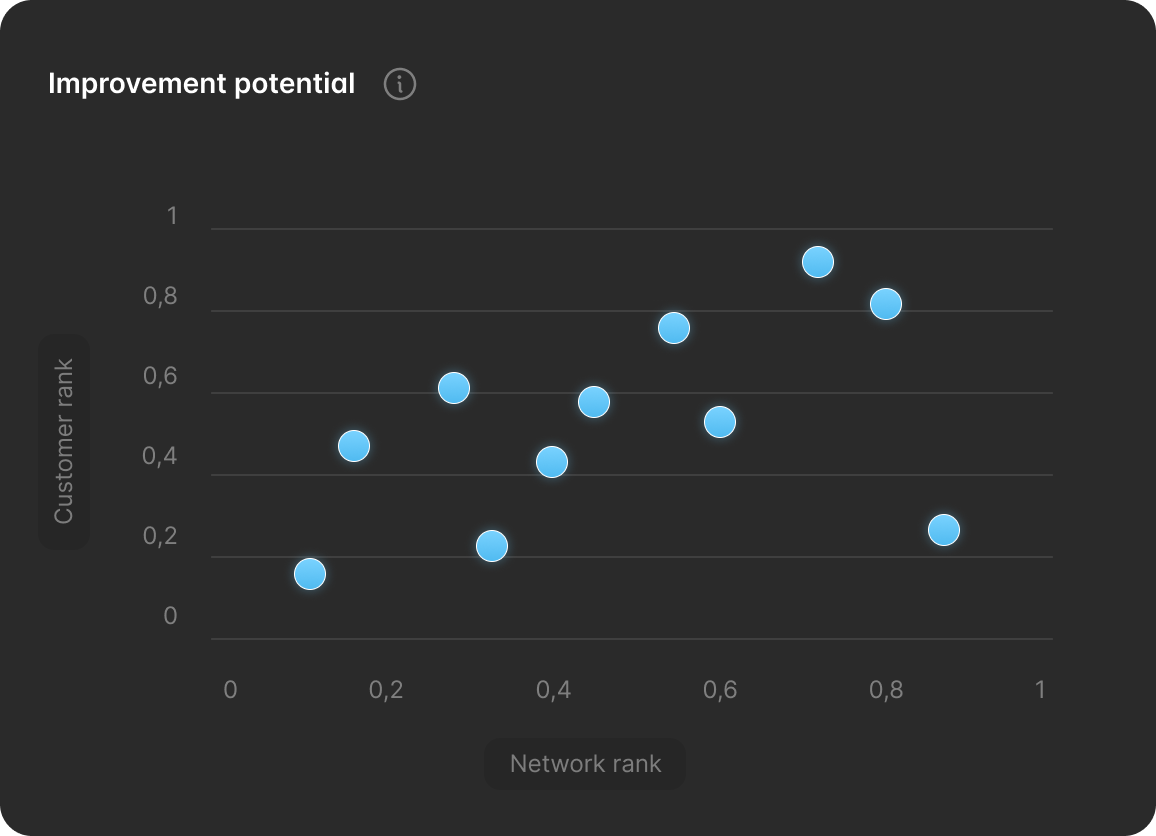
Scatter chart. Shows distribution on a two axis scale.
Before & After comparison
I designed the Noda Copilot to provide immediate situational awareness. Using ‘stoplight’ logic (Green/Yellow/Red), operators can instantly assess system health before diving deep into the data.
Drag the line to see before & after